10 Ceruri represents a strategic branding journey rooted in vision and purpose. From defining a meaningful name to shaping a cohesive brand identity and communication framework, the project illustrates how clarity, creativity, and consistency can elevate a business into an inspiring story of growth.
10 Ceruri
Let's get a bit of context
This project’s driving claim was that life is a series of all sorts of experiences … imaginable and unimaginable, we would now add. And this motto was given to me by Floriana:
The Brief Challenges
What we were asked to deliver
As per the requirements of the client’s brief, this project had 3 main requirements Business Booster team had to take into consideration:
- Find a brand name project for our client, Floriana Ungureanu; a brand name that would raise interest and be relevant in the context of the topics tackled;
- Propose a technical solution that would allow the client to easily update on her own new content;
- The client specifically asked not to get involved in the technical maintenance aspects.
Deliverables
All the things we delivered
So, to summarize the digital and marketing work we did for 10ceruri project, here it is:
- Brand strategy
- Naming
- Brand Identity, including a brief brand identity manual
- Website production
- Content (SEO), taxonomy
- User Experience, Information Architecture,
- Social Media production and management
- Project Management
We end this branding project story by leave you few of creative work we deliver for the project launch and the months that followed.
And what a life discovery journey this project was! Not only we got to work with one of a kind client, namely Floriana Ungureanu, but we ended up discovering a world we knew more or less about it. Therefore, here we are with a two-faces open invitation – firstly, to see how we work; secondly, to travel in the realms of spirituality and self-discovery.
The Brand Making Journey
A step by step approach
We are delighted to have worked with Floriana Ungureanu, Owner & Content Creator of 10ceruri.com, a client who knew exactly what she wanted. It is also fair to say that we worked smoothly as our client was and willing to get out of her comfort zone. Lucky for us she was extremely open to what we had to say concerning specific topics we had to solve.
One of the first things we clarified with the client was the brand promise. There were few things we knew for sure:
- It was not about giving people guaranteed solutions for personal or spiritual development.
- Any transformational journey is unique in its own way, no matter how much alike two people seem to be. That was also the reason why copy-paste solutions do not always work as expected.
- There are just too many personal variables.
The content, the topics tackled were not for those fainthearted ones.
The Brand Promise. Mission. Values
What we realize was one simple truth. One reality, that of a story full of personal experiences and learned-by doing wisdom. Therefore, we refined the BRAND MISSION as follow:
Open the eyes and minds of the readers to the spiritual realms through shared personal experiences.
At the heart of 10 Ceruri are three BRAND VALUES — Courage, Responsibility, and Authenticity — which shape not only how the brand communicates, but how it lives and grows.
- Courage is the boldness to speak your truth and share your vision, even when it challenges the familiar. It’s about confidently taking a stand and inspiring others through conviction and clarity.
- Responsibility reflects the brand’s commitment to integrity. Every choice, action, and message is owned fully — with mindfulness of its impact and a dedication to positive, meaningful outcomes.
- Authenticity builds trust, resonates deeply with people, and allows the brand to connect on a human level.
Together, these three brand values define 10 Ceruri as a brand that is courageous, accountable, and genuine — a brand that clients, partners, and audiences can believe in and engage with confidently.
Looking for a Bold Brand Name
Of all the ideas both client and we had for the brand name, “10ceruri” (aka 10skies) was the one that got all our votes. It was a brand name proposal that came from Liviu Cristea, Content Creator & Producer, and one of Business Booster’s consultant partners.
For those of you wondering why we all so delighted with “10ceruri”, here’s the short list:
Communicates the brand essence – When one takes the path of the spiritual journey and self-discovery, it needs to confront and harmonize the well-known polarities: the light and the darkness within, the good and the bad, the ying and the yang, the feminine and the masculine, and so on. In addition to that, to those already familiar with the esoteric world, there’s a clear distinction between the 10 upper (the light or the above) and 10 lower skies (the darkness or the underworld);
Unique within its industry – Differentiates the client from her competitors, it stands out from the crowd. It’s intriguing and stirs up curiosity.
Enduring – On the long run, 10ceruri is not a trendy or too niche name. It’s flexible enough to accommodate new spirituality or personal development related topics, events, books etc. If the focus expands, the name will still fit. Therefore, no future issues with the naming not being able to remain representative or relevant.
Brevity & Sonority – In Romanian langauge, 10 skies (AKA 10ceruri) is a short name and a memorable name given by the use of strong consonants such as z and double r. As may well know, brevity tends to lend itself to memorability. So, choosing a short and punchy name is one way of making sure it won’t be easily forgotten. It’s not just easy to remember, but also easy to pronounce. And this one important treat of good brand names.
Personality – It is often said that the most memorable names invent their own language, or try something new. And this is exactly what we did. We combined words or concepts. We took a chance, knowing that customers appreciate independent, risk-taking brands. Plus, so is 10ceruri‘s owner, Floriana. Striving to be different always pays off. Not only 10ceruri reflects the character of the brand, but it also embraces the owner’s personality.
Tone of Voice
Well, this is one aspect of the project that we did not interfere as much as in other branding projects. And the reason is quite simple. Our client already published online many articles and her personal style matched perfectly the brand’s personality.
As far as the font is concerned we went for Garamond. As a Google open source typeface, it’s free and easy to use, not to mention it’s web-friendly, ensuring consistency across platforms.
Typography
As you know, a brand’s core visual brand identity is made up of a holy trinity of design: Logo, Color and Typography. Each one serves a unique and clear purpose, requiring careful consideration and intention. Let’s see how we approached this in 10ceruri brand’s case.
As far as the font is concerned we went for Garamond. As a Google open source typeface, it’s free and easy to use, not to mention it’s web-friendly, ensuring consistency across platforms.
Such an open-source typeface is a popular option for many brands, particularly startups or bloggers. Since anyone can use them, sure there’s a risk of being perceived as basic, bland or boring, yet we believe this can be overcome by smartly combining it with other brand visual elements and a great selection of images.
In 10ceruri’s case, images truly speak a thousand words for they take you in a world of mythical creatures and mysteries. And if Microsoft, IKEA, Netflix and other big brands can afford to use open source typefaces, why not 10ceruri? Plus, there’s always the budget aspect!
10ceruri Logo
simple, clean, inspiring
As part of our strategic brand‑identity workflow, we didn’t stop at values — we entered a structured brainstorming phase aimed at finding the perfect icon element to visually encapsulate the brand’s essence. Through collaborative workshops and concept reviews, we explored multiple visual metaphors, sketched iterations, and tested symbol‑systems.
The breakthrough moment came when we aligned on a composed icon: three stars (representing the trinity of values) paired with two planetary elements (Full Moon and Sun) — forming a symbol that ties the brand meaningfully both to the name “10 Ceruri” (10 Skies) and to the spiritual journey framework of light and darkness.
This icon, integrated across logo versions, colour palettes, typography, and visual identity collateral, ensures that the brand speaks with both strategic clarity and symbolic depth. In doing so, 10 Ceruri presents not just as a name and logo, but as a cohesive identity — grounded in purpose, poised for impact.
We chose the colors and here it was, 10ceruri primary logo! Simple, clear, self-explanatory.
In today’s diverse mix of technologies, media formats and customer habits, having a lot more than a logo to visually (and verbally) present a business is mandatory. That’s one of the reasons we believe in delivering clients brand manuals, secondary graphics and “logo variations.” And all these practical tools for building 10ceruri brand were created.
We also knew that our client is already a speaker at many seminars, workshops and all sorts of events. These offered her the chance to increase 10ceruri project awareness. Therefore, we created a logo variation that allowed her to simultaneously communicate the project, the website and her identity. Once again, it is simple, clear, easy to read. Plus, it had visibility when added on event posters, no matter the additional visuals and texts printed.
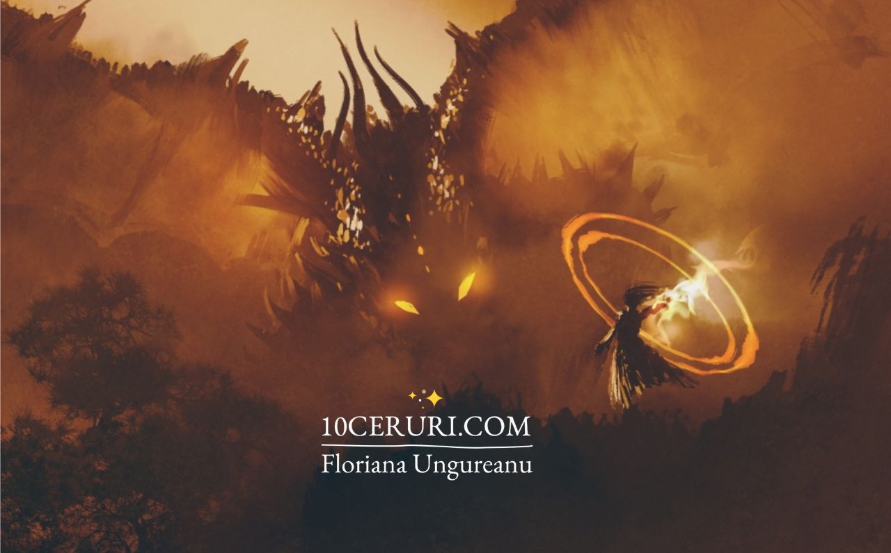
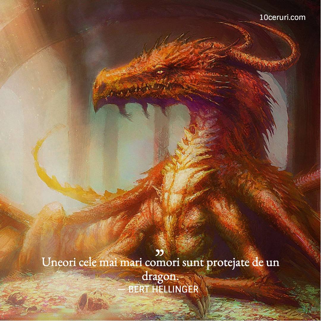
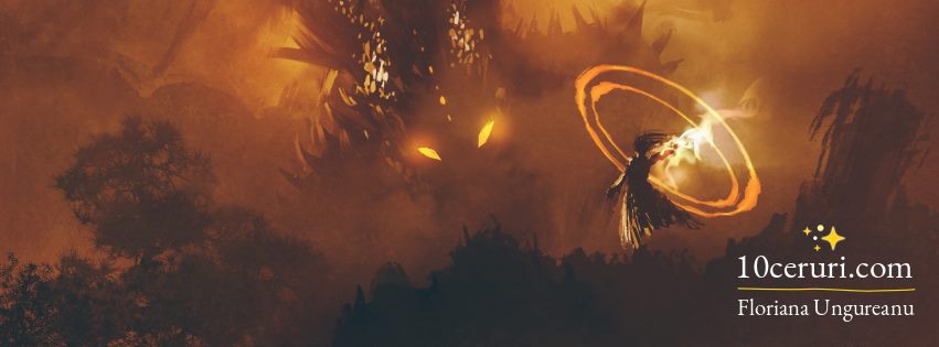
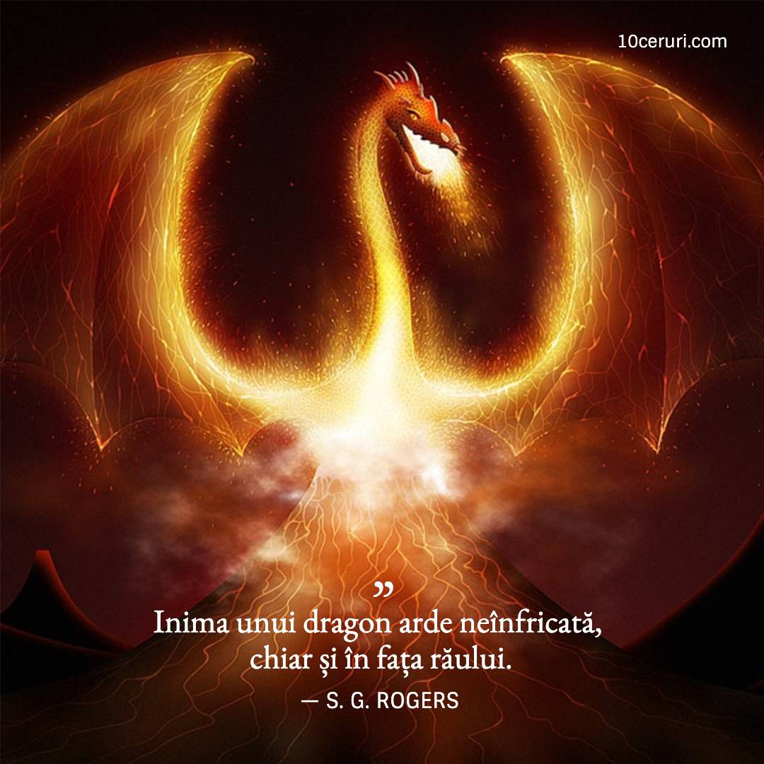
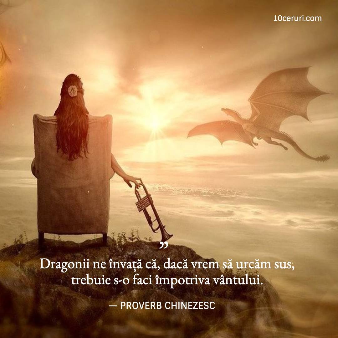
The Imagery 10ceruri Needed
#fantasy world #invisibleworld
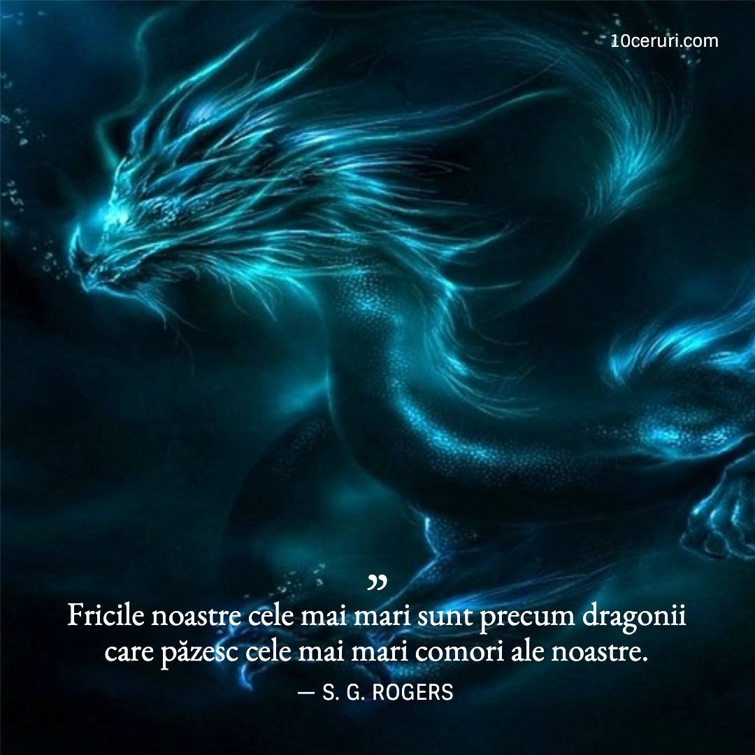
In terms of visuals, we chose the fairytale-like images as they would help the reader better emotionally connect with the content. We could not ignore the fact that an image speaks a thousand words.
10ceruri.com Website
Technical Solution. UX, IA & SEO. Content Production & Updates
We decided to approach Pets of Champions as a startup project. We assessed our resources and defined an MVP (Minimum Viable Product). For Discovery team involved this was something quite new. It showed them a new way of managing a production project. A new way of doing things in the digital world.
With such a digital-by-birth project and limited resources, we knew we had to settle for less than we actually dreamed of. We always had to remind ourselves that “there are perfect projects and launched projects.” Not the easiest thing to do when you have two perfectionists running the show!
As far as technology is concerned, there is not so much to tell. We decided to use Squarespace.com as a platform. Having around-the-clock IT support, hosting and a great variety of web of fully responsive templates were some of the reasons why. Plus, having an easy Content Admin User Interface was a critical factor having neither dedicated nor digitally-experienced people. We had no time for training people, and none of the interns worked with Content Management System before.
INFORMATION ARCHITECTURE – If you visit 10ceruri.com, you’ll find it easy to understand what kind of content it offers, but it is also to navigate. That happened thanks to a very simplified information architecture we proposed to the client who initially had a lot of website content areas. Labels are also intuitive, relevant for the content they cover and easy to understand at first glance.
CONTENT STRATEGY & DEVELOPMENT – Fortunately, we had a client with an appetite for writing and willingness to learn the online writing & content SEO principles. Therefore, producing new good quality content came easily. Our input on editing and SEO optimization decreased significantly from the first articles we revised to the last ones. And it’s really great to see a fast learner client.
At Business Booster we are all about ensuring a non-dependent Agency-Client. We are striving to offer our input and ideas in those more specialized areas of the digital environment. It’s a work philosophy, if we can call it so, that makes both parties happy.
Social Media
Gratitude for the nice words
When analyzing the type of content to be posted on Instagram, we identified few templates we had to create: quotes, articles and events.
Considering the time and cost resources, the client decided to focus solely on Facebook and Instagram accounts. Therefore, we created easy to use Fotor templates for the client. Once again, by using a free Fotor account, we saved costs and made the client’s life a little bit easier.
- QUOTES – Knowing the great appetite of online readers for quotes, but also Floriana’s talent for choosing them, we created an easy to update special template. We chose a template that would easily accommodate different text sizes and also take advantage of the magical photos.
- EVENTS – A simple and clean layout for promoting events on Instagram. Just in the case of other Social Media layouts for such content, it uses Roboto font family.
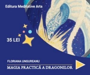
- BANNERS – While we were busy working on the website, Floriana Ungureanu was about to launch her first book called „The Practical Magic of the Dragons”, so we came up with some ideas of communicating this on the website. Below you can see one of the banners used for promoting the newly launched book available for online shopping on the website of the publishing house.
- FACEBOOK COVERS -Two branded Facebook cover photos for 10ceruri fan page. Simple, clean, using one brand-relevant images.
You can see them all in the gallery at the end of the case study.
Testimonial
Gratitude for the nice words
Launching a digital project well is one thing, yet growing it properly, in the long run, is another. This latter thing we believe to be an essential part of our job and when you see it happening, it’s all worth it. Therefore, congrats, Floriana for beautifully growing 10ceruri.com project further!
I used to write long Notes or posts on Facebook presenting my thoughts and experiences, and every time I wanted to remember them or share with someone I had to look for them and remember when and where and how. Soon I have realized and everybody around me advised me that it would be better to have my own site, not only for those short stories but also for better presenting myself, my books, and the events that I propose. I am a sort of Jack of all trades, I know a little about everything without being an expert in anything except the written word. I have a tendency to complicate things, nevertheless, I know that simple is the best, and it is better to have a good start. A good start means turning to an expert for advice and for getting the job done. It pays to have a professional look, to establish your brand name, to make a lasting impression.
Ana-Maria took all my raw materials and turned them into exquisite pieces of jewelry present now on display on the website, still, that wasn’t the most significant contribution, but the fact that doing so she established a streamline for me to continue, a framework in which all my future work can be fitted into.
The technical solution proved also to be the best option even in the long run, and I have decided to stick with it, as indeed it is minimum effort, best results at a convenient price, believe me, I have double-checked!
The best looking and most informative website is useless if is not visible from the first search, and that is ensured by a good SEO engine, and that in itself is expensive and difficult to configure. I am a sort of geek myself, so I know things, enough to recognize a good deal.